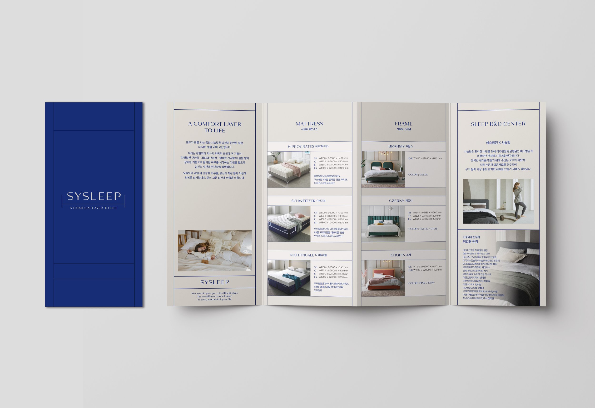
Sysleep
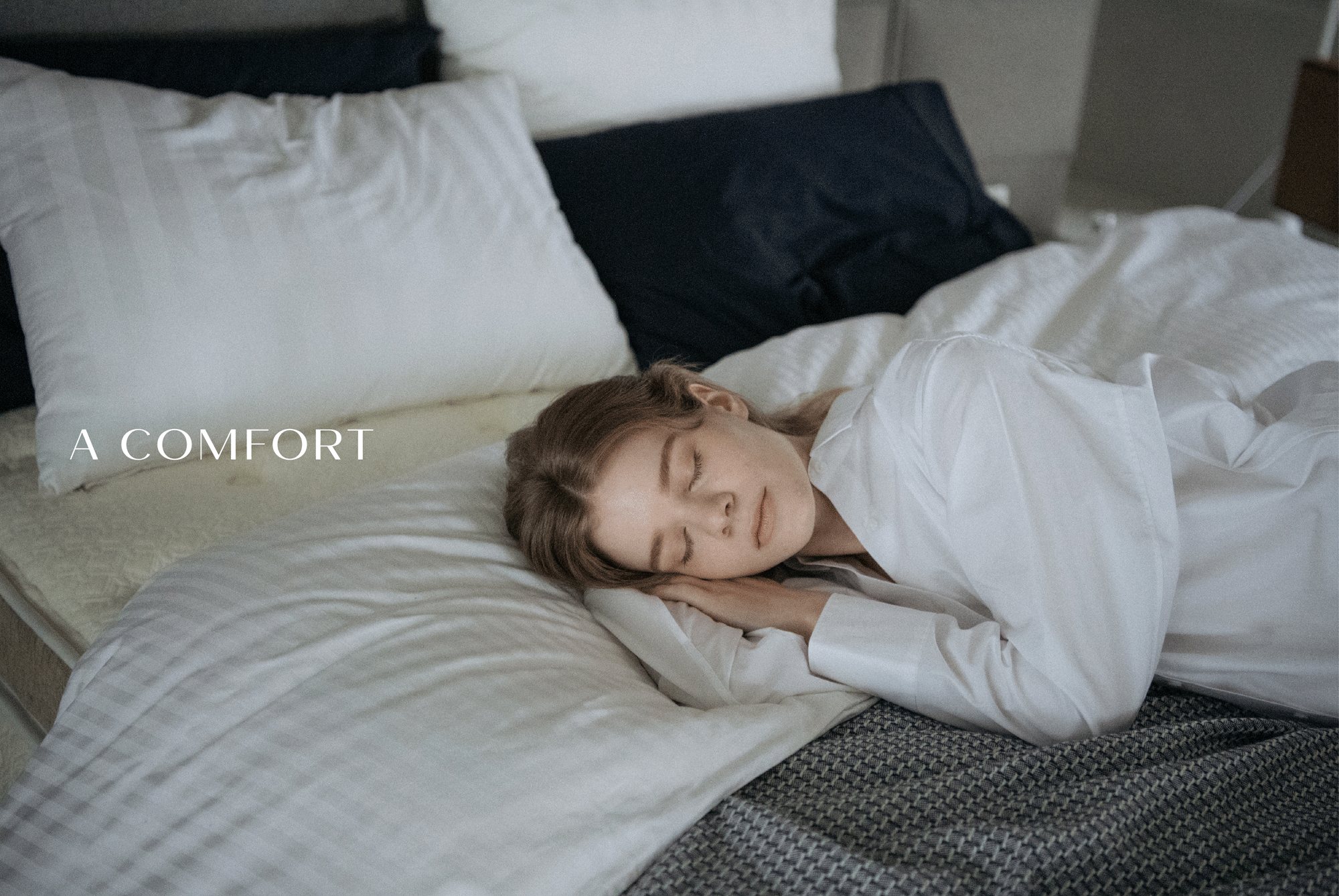
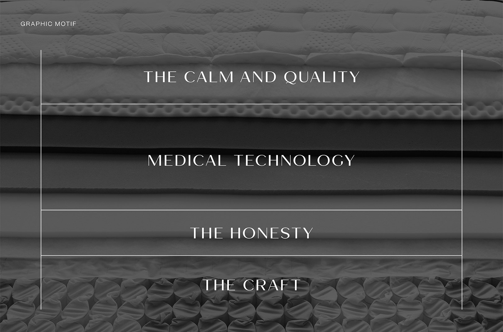
A premium bed brand, SYSLEEP considers customers' sleep and quality of life with a minimal, premium, and organized feel. The graphic motif gives a minimal and premium mood that expresses the various layers of life. The overlapping lines and the space between them can be a flexible motif that expands into different shapes depending on the intention and use.
The new logo of Sysleep was developed expressing S, which uses spring characteristics of the mattress, E for layers of the mattress, and the round edge like the soft curves of the bed. The updated wordmark conveys a minimal, premium, and organized feel. The graphic motif gives a minimal and premium mood that expresses the various layers of life. The overlapping lines and the space between them can be a flexible motif that expands into different shapes depending on the intention and use.
Categorize: Brand Identity, Application, 2021
Client: Seyang Bed Inc.
Creative Director: Yoona Liz Lee
Lead Designer: Haley Oh
Designer: Yena Park
Agency: YNL