Wink Plastic Surgery
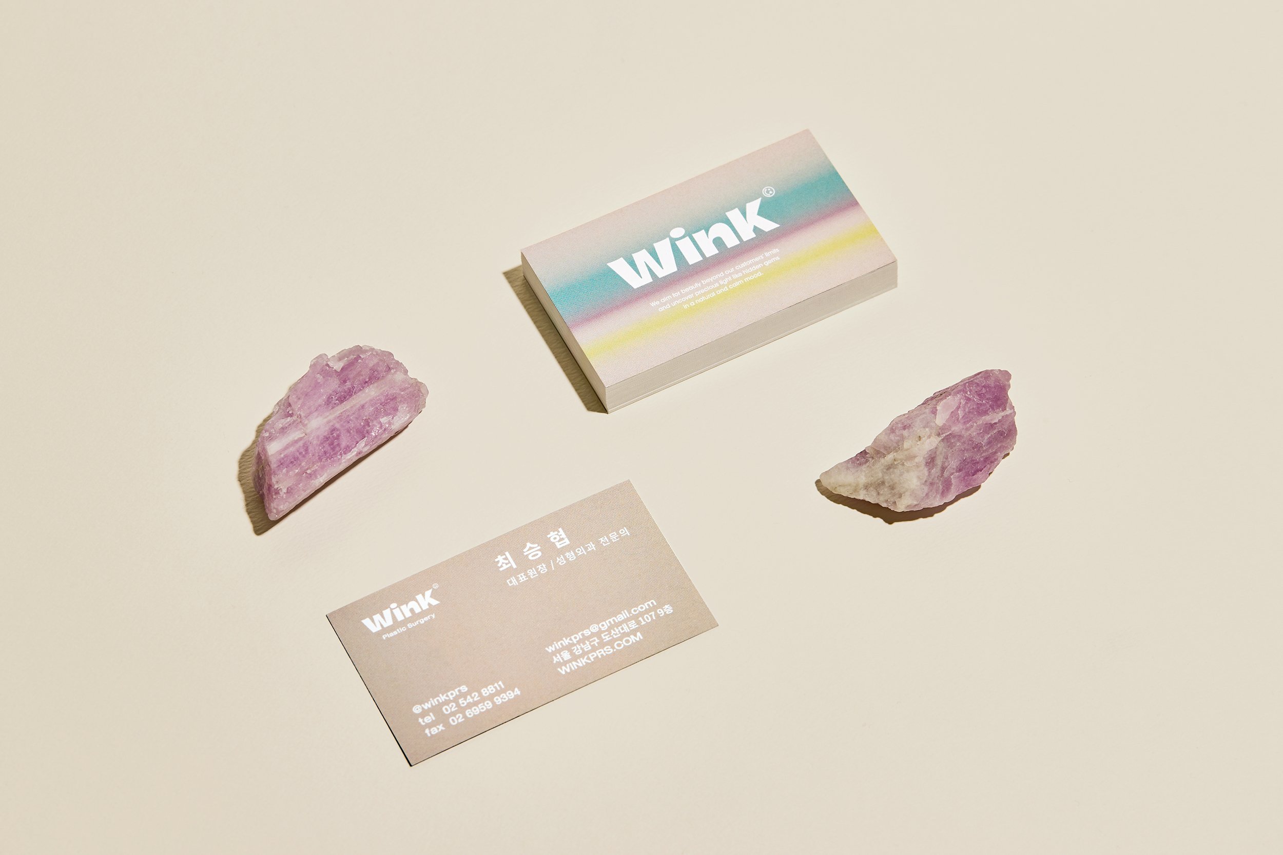
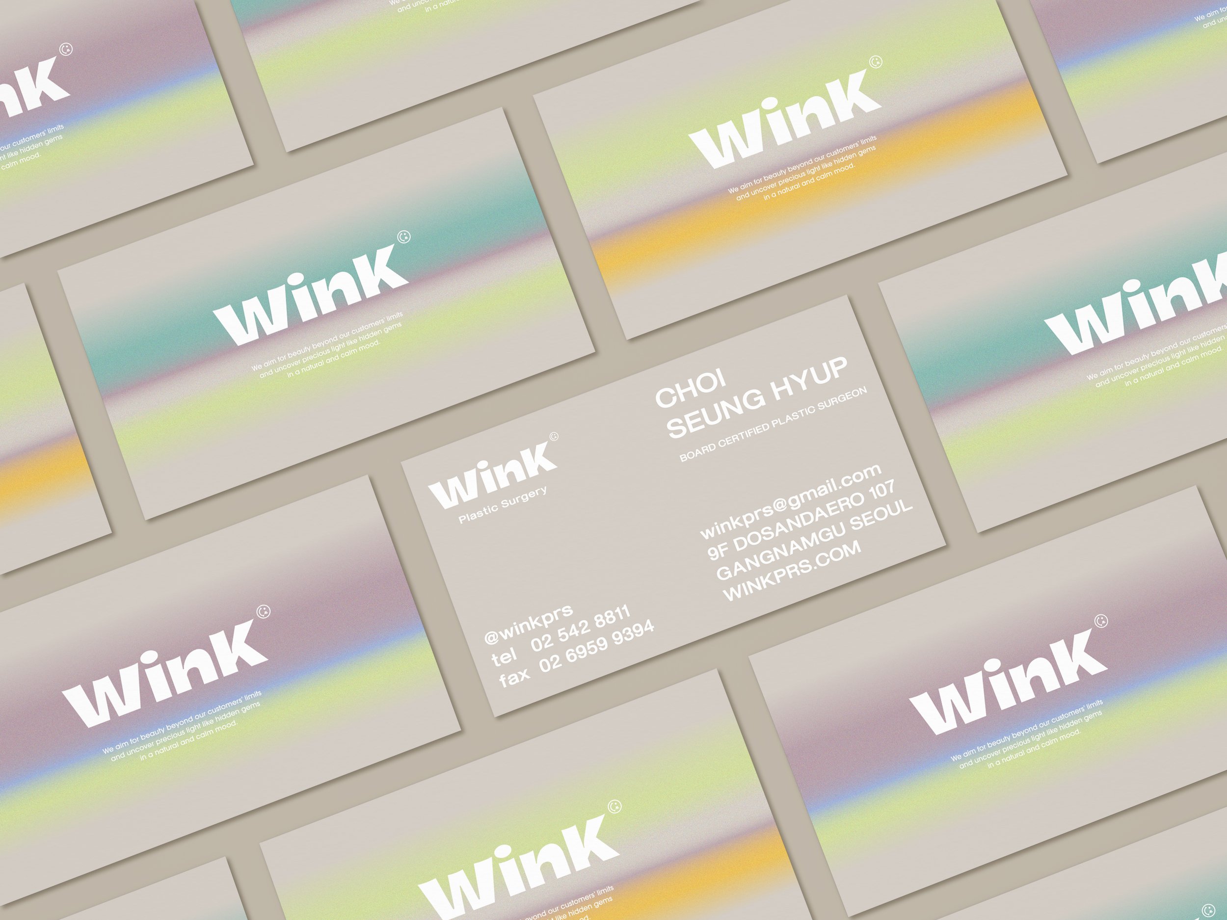
Wink plastic surgery clinic provides the best beauty solution customized for customers based on accurate diagnosis and treatment through the representative doctor Choi Seung-hyeop who has many surgery experiences.
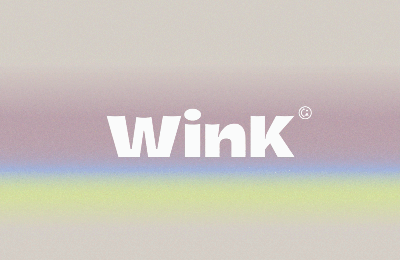
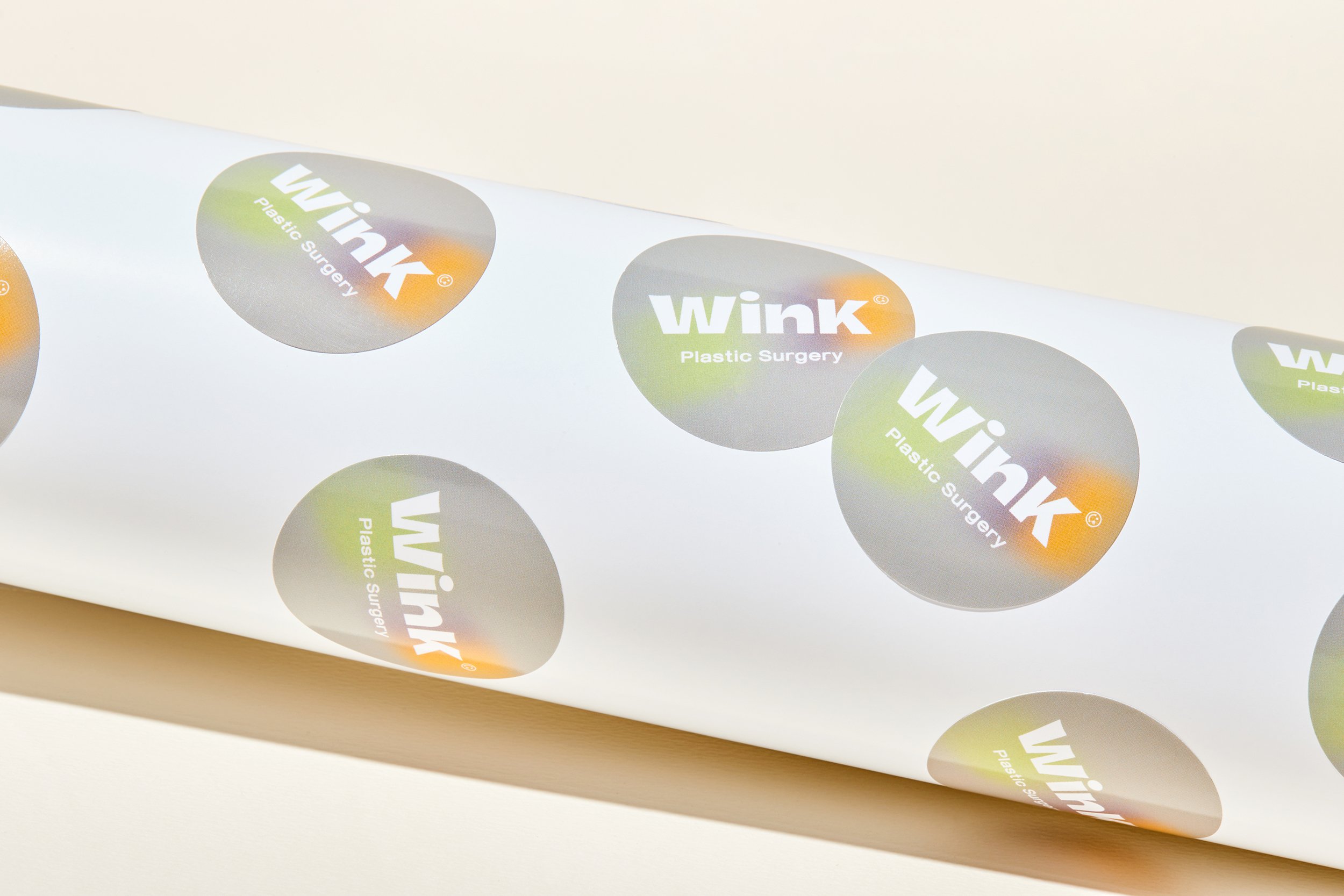
The brand concept was defined as 'boundaries of aura' by embodying the attitude of modern women who confidently express the individuality of their beauty. It delivers the brand value of 'Find jewelry-like hidden aura in customers and help them go beyond the bounds.' Designed with sans serif wordmarks, the logo of Wink plastic surgery clinic, which is specialized in eye re-operation, represents a bold and modern personality and visualizes the shape of eyes by concavely designing the upper line of each typography. Inspired by a beautiful aurora, the brand color was expressed as gradated various color tones in the motif. The brand motif, designed with colorful lights and movement art, is applied to numerous applications, creating a noble and beautiful sensibility. Various colored motifs and concise layouts are also used on the website, naturally reflecting the brand identity of Wink.
Categorize: Brand Identity, Application, Website, 2021
Client: Wink Plastic Surgery
Web: winkprs.com/_ENG/
Creative Director: Yoona Liz Lee
Designer: Haley Oh, Eunhye Lee
Agency: YNL