Peer the Seer Tarot
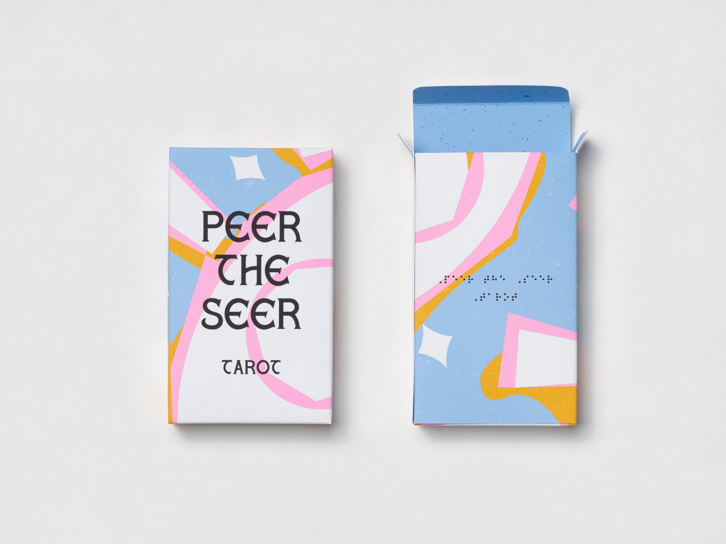
Peer the Seer Tarot helps break down the boundary between blind and sighted people and connects them with unique and colorful visual design with braille. The illustration style is inspired by Henri Matties and abstract artworks, while colors are drawn from the lovely aesthetic of the anime, reminding people to enjoy effervescent art.
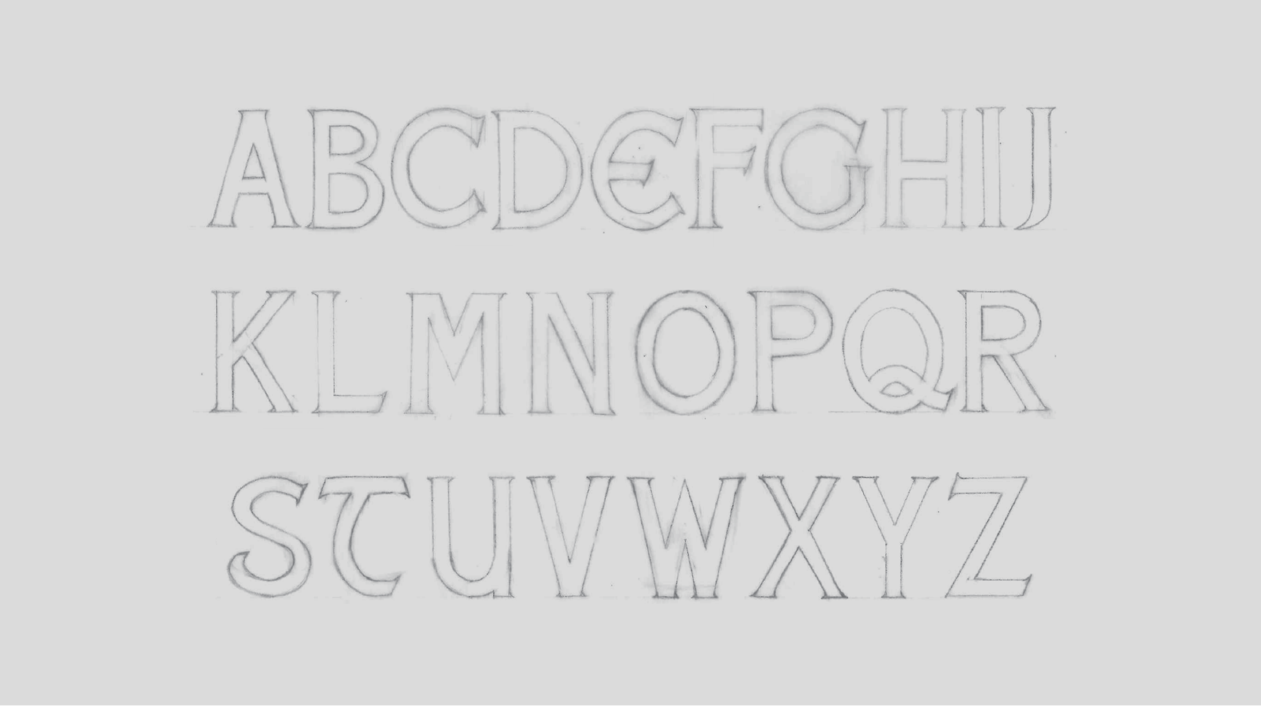
The Kawaii aesthetic of the Japanese anime Card Captor Cherry mainly inspires the color scheme. It depicts warm pastel colors to express bright and playful sensibility. Also, it represents creativity with diverse warm and natural colors to portray a magical and dreamlike mood. Next, I created the Peer the Seer custom typography. It was crafted exclusively for the Peer the Seer Tarot project. The construction of Peer the Seer Custom was inspired by a whimsical aesthetic and an ancient heritage of tarot cards. It is a modern reinterpretation of ancient letters to create a sense of nostalgic wanderlust. It is modified from the LHF Factory font with a more timeless and contemporary look. The serif and stroke endings are sharp, while the curves are round and playful.
Categorize: Brand Identity, Typeface Design, Packaging, 2022
Self-initiate Work